

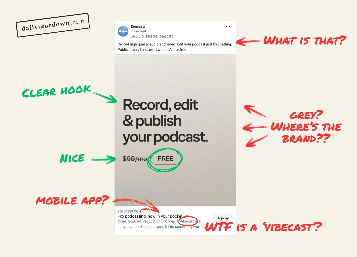
The Hook
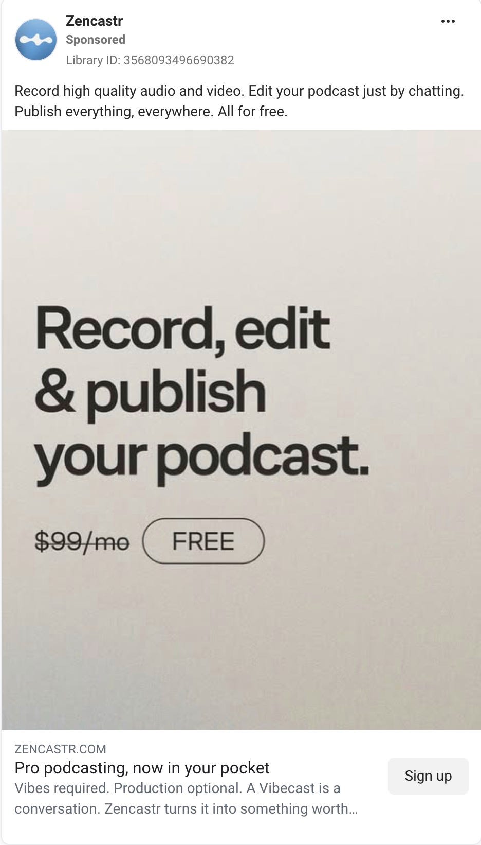
I’m a copywriter, so I’m underqualified to talk about design. But I’m left conflicted by this ad’s design. I’ll come on to that shortly.
On the copy, I really like this for a hook. “Record, edit, & publish your podcast” is enough to maybe not grab the attention of an aspiring podcaster, but at least catch their eye.
The bit that really hooks it is “FREE”. It’s not trying to be overly clever or witty. It just tells the reader, at a glance, that they can start a podcast for free. Very little to critique here on the copy side. It’s clear, blunt, and will grab the attention of their target demo here.
The design is my biggest issue, though. Zencastr has been around for AGES now. Over a decade at least. And assuming their target is BOFU — where the person knows they want to start a podcast, but maybe haven’t actually taken the step to pick a stack and start recording — there’s a strong chance the reader has already googled “How to start a podcast” or something similar.
So they might have already seen Zencastr, and be at least marginally aware of their brand name and branding.
So why wouldn’t you use your brand colours, and include the word ‘Zencastr’ somewhere in the image? That could make them think “Not only does this sound appealing, but I’ve also heard of this product”.
Instead they went with black font on a grey background. Why?? It’s like whoever made this design actively didn’t want anyone to read it. Which I think is a shame.
The Angle
As I said, this is clearly a BOFU angle. They’re trying to catch someone just at the point where they have an idea, they’re pretty sure, and now the message is “You can start today, risk free”.
Which the hook nails.
And the primary text starts off strong. “Record high quality audio and video” reassures the reader that free doesn’t mean poor quality. Great.
And the last line “Publish everything, everywhere. All for free.” does a good job of giving another reassurance that you can publish with Zencastr, then reminding you again that it’s free. Not subtle, but this is advertising.
But the middle sentence “Edit your podcast just by chatting” breaks the flow. The hook grabbed me, the first sentence reassured me, then this sentence introduces friction.
What do you mean I can edit by chatting? Is that something I want? Can I edit my podcast with an editor like I expected? Or do I have to chat to Zencastr?
It’s an alien concept, dropped in as if I’m supposed to know what it means. Which actually tells me as a reader that it might not be for me.
For the purpose of this ad, they should have just included “Built-in editing tools” or something. Just to remind them again that this is an all-in-one platform. If you’ve got a new fangled editing AI chatbot thing, give it it’s own campaign. For this, keep it simple.
This is the kind of friction that gives someone enough pause to scroll past.
The Ask
The headline “Pro podcasting, now in your pocket” line is a little bit odd. “In your pocket” is a cliche in ads, but normally reserved for mobile apps. Nothing so far has mentioned it’s a mobile app.
Sorry to skip ahead, but I checked the landing page, and apparently “Pro podcasting, now in your pocket” if their new slogan because yes, they have a mobile app and they’re clearly pushing this as their new positioning.
Which would be fine, if anything in the rest of the ad mentioned this. It’s not in the hook, the image, the primary copy. Based on this headline and their landing page (which is just their homepage), it seems this campaign is supposed to be promoting this new mobile positioning. But it’s first mentioned in the headline. Which is odd.
Then it continues to get weirder. “Vibes required”…huh? Why are we talking about vibes now? “Production optional”?? What does that mean? This is an ad about podcast production. How is it required?
“A Vibecast is a conversation” — am I having a stroke? What the fuck is a ‘vibecast’? Is that a new term I haven’t heard of. I’m nearly 40, but I wouldn’t say I’m over the hill yet. I even googled it, which didn’t help:
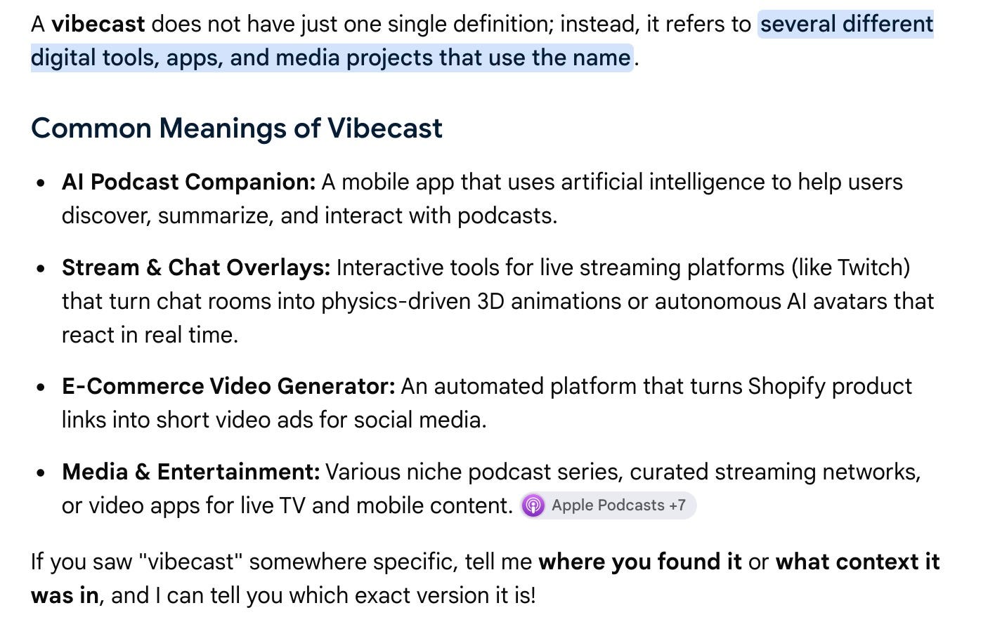
If I scroll down to the bottom of Zencastr’s website, I find this copy: “Your phone is your podcast studio.Start vibecasting.”. So I guess this is a term they’re using to mean a podcast you do without needing all the equipment and knowhow. A play on ‘Vibecoding’ perhaps?
But then under it, it says “Get Zencastr for Desktop to access a full professional creator tool stack.” so fuck knows what’s going on.
Regardless of what vibecasting is or isn’t, it’s a bizarre inclusion in this CTA. And it feels like the first half of the app was written by a different person than the person who wrote the headline and description.
These two bits of copy just needed to reiterate that they can start podcasting today at zero risk. It’s free, it’s easy, and there’s no reason not to click the button and get started.
The Landing
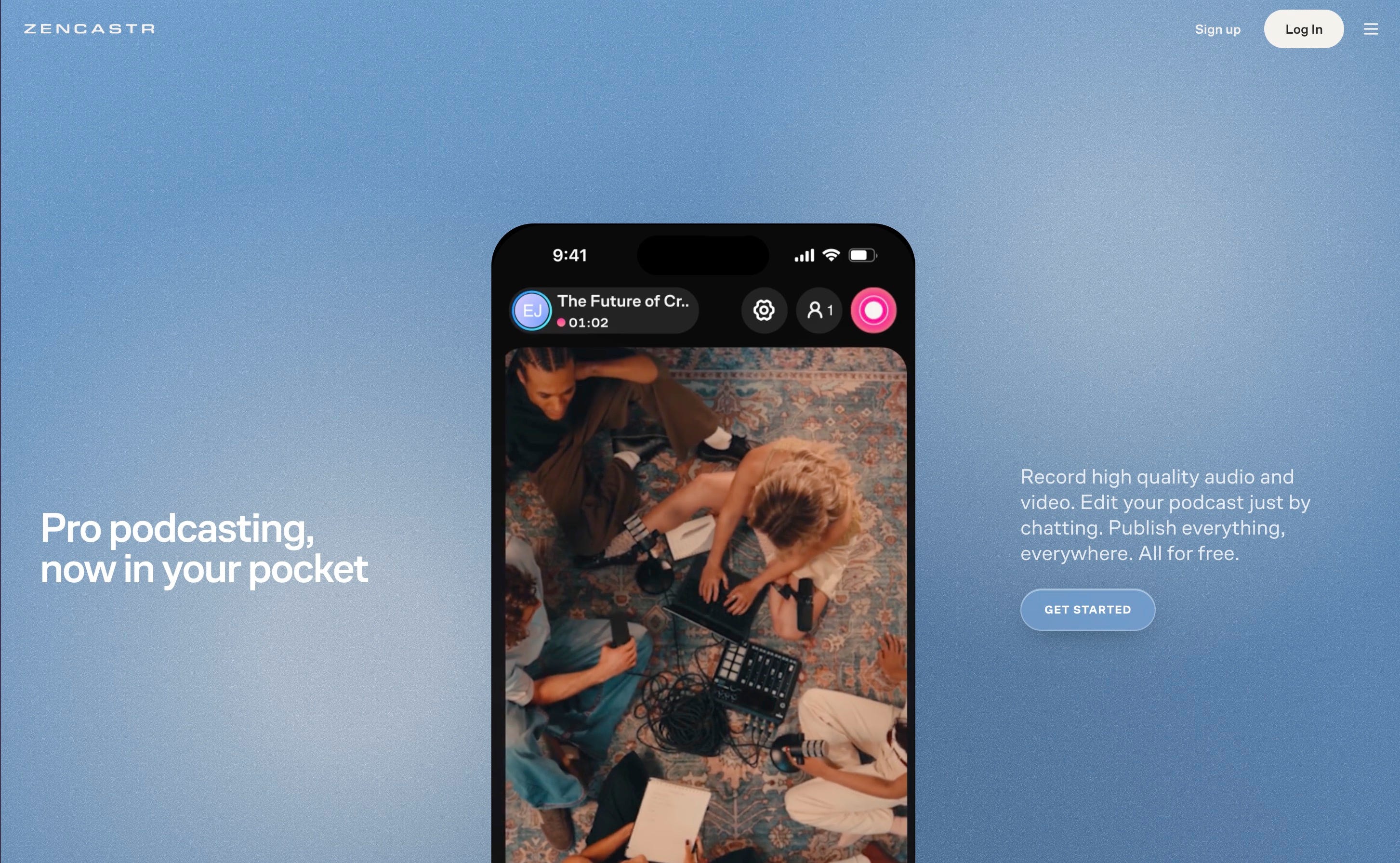
Firstly: why wasn’t the ad this blue gradient instead of the grey gradient?
But more importantly, if you clicked this ad after just reading the image and primary copy, you’d be a bit confused. And that’s somehow despite the fact the ad is a copy and paste of the landing page.
Your first question is “This is a mobile app?”
Nothing in the image or primary text set that up. If their big hook is now “Pro podcasting, now in your pocket” (lazy copy, but largely fine), why isn’t it the heading copy in the image?
Why isn’t there a picture of someone recording a podcast on their phone. Or chatting with their chat-based editor?
It’s odd to hook in with “Record, edit & publish your podcast. FREE” to then switch it up to “DID YOU KNOW IT’S A MOBILE APP NOW???”
The Verdict
Clearly, this as wasn’t actually written as an ad. Maybe it was last thing on a friday or something. So they just copy and pasted from the homepage, then threw together an image on Canva just as they were standing up to put their coat on.
So instead of reiterating what I’ve said here, I’ll say this: web copy and ad copy are different things. They do different jobs. Your web copy has an advantage that they’re already on your website. If someone is on the Zencastr website, it’s because they want to start a podcast, and are trying to work out why not to use Riverside.
An ad, on the other hand, doesn’t have that advantage. It needs to grab you, tell you a story, and get you to click a button. All in a couple seconds. So you can’t add so much friction like they’ve done here.
Disclaimer: I was just reminded that I invested $630 in Zencastr a few years ago. Obviously this didn’t bias my critique, but wanted to mention for full transparency. Ironically, I prefer and use Riverside.