

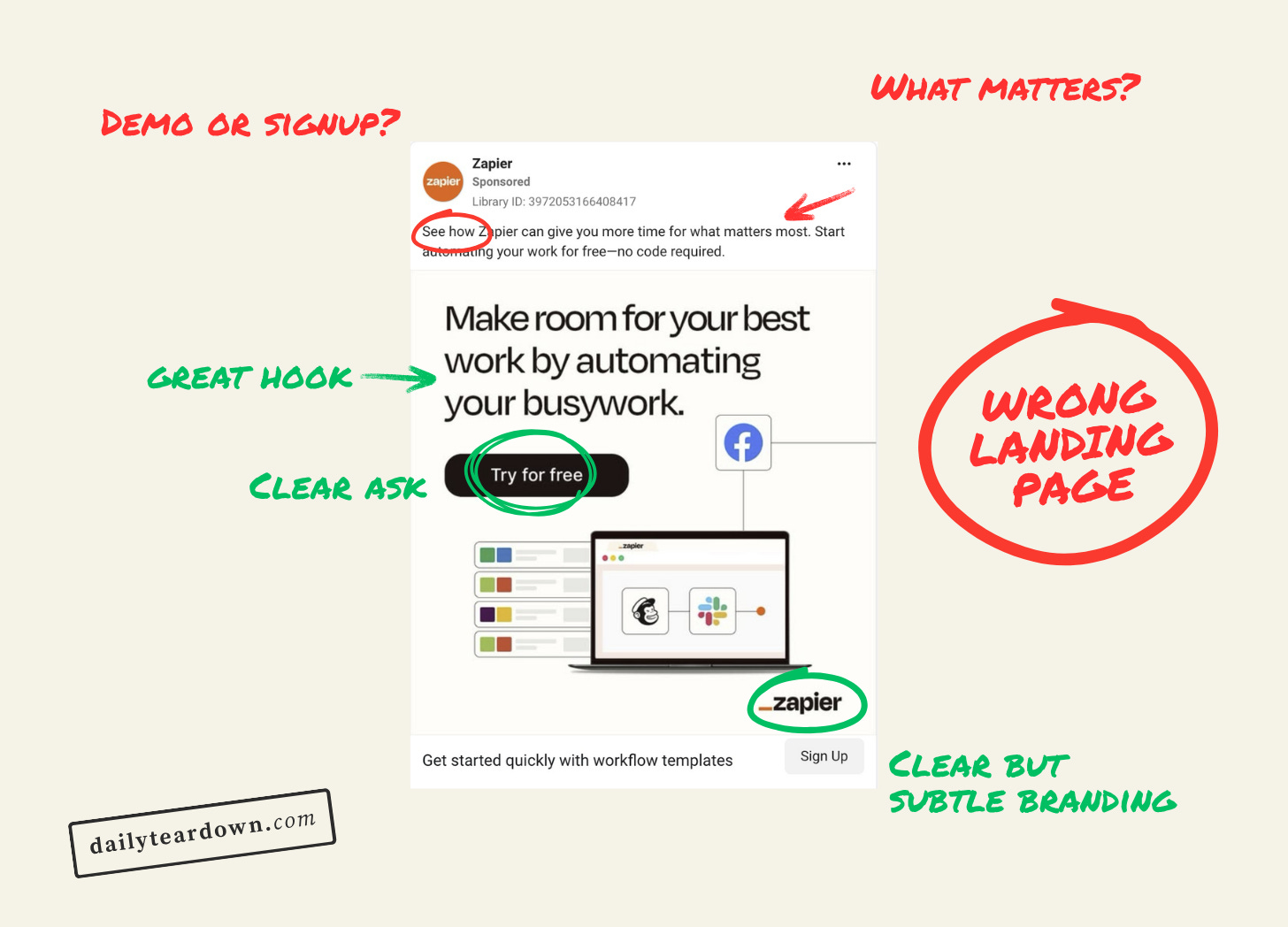
The Hook
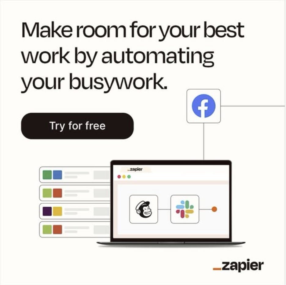
Sometimes simplicity is the best approach. And “Make room for your best work” just twangs a nerve in the best way. We all believe we’d do better work if we didn’t have other shit to do.
Then “by automating your busywork” just finishes the hook beautifully by reinforcing this belief in our heads. If we didn’t have to do the stuff we don’t want to do (busywork), we can focus on the stuff that we do. The important stuff. Our best work.
This is clearly a BOFU ad. They have the Zapier logo bottom right, which most people probably recognise by now. At least most people this ad is aimed at. And the image does a good job of including an image without cluttering or overcomplicating.
The only thing that throws me slightly is the facebook logo. I know you can do automations with facebook, but whose ‘busywork’ is Facebook? But that’s tiny, and probably doesn’t add any friction.
The Angle
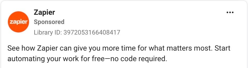
The primary text of this ad is fine. It’s functional. “See how Zapier” could imply it’s a demo rather than a sign-up CTA coming up. And “for what matters most” feels like a waste. They could have included some specifics here to double down on what could be automated.
Then “Start automating your work for free—no code required” is fine, too. With who their target audience probably is, the emdash could be a misstep (it’s seen as an AI hallmark these days). So I would replace it with a period and just include “ No code required” as a standalone sentence at the end. But I’m nitpicking here.
As I said, this is a BOFU ad, and they’re more trying to grab people who are already likely to want to give Zapier a chance. So this ad feels a bit more like “Hey, remember that thing you checked out the other month. Maybe now’s the time to give it a go!”
It could be telling a more relatable story or including more specifics. But it’s fine.
The Ask
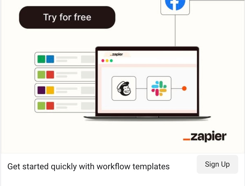
The “Try for free” in the image does a good job in making it clear what the ask is. Try Zapier for free, with no obligation.
Then “Get started quickly with workflow templates” is another bit of inoffensive, reassuring copy. Mentioning templates is smart. In fact, templates could have been mentioned in the primary text for a more consistent and reassuring narrative.
But by and large, this works. No description, just the ‘Sign up’ button. They know they’re not doing the hard sell here. They’re just popping up to remind you they exist and that it’s free to get started.
The Landing
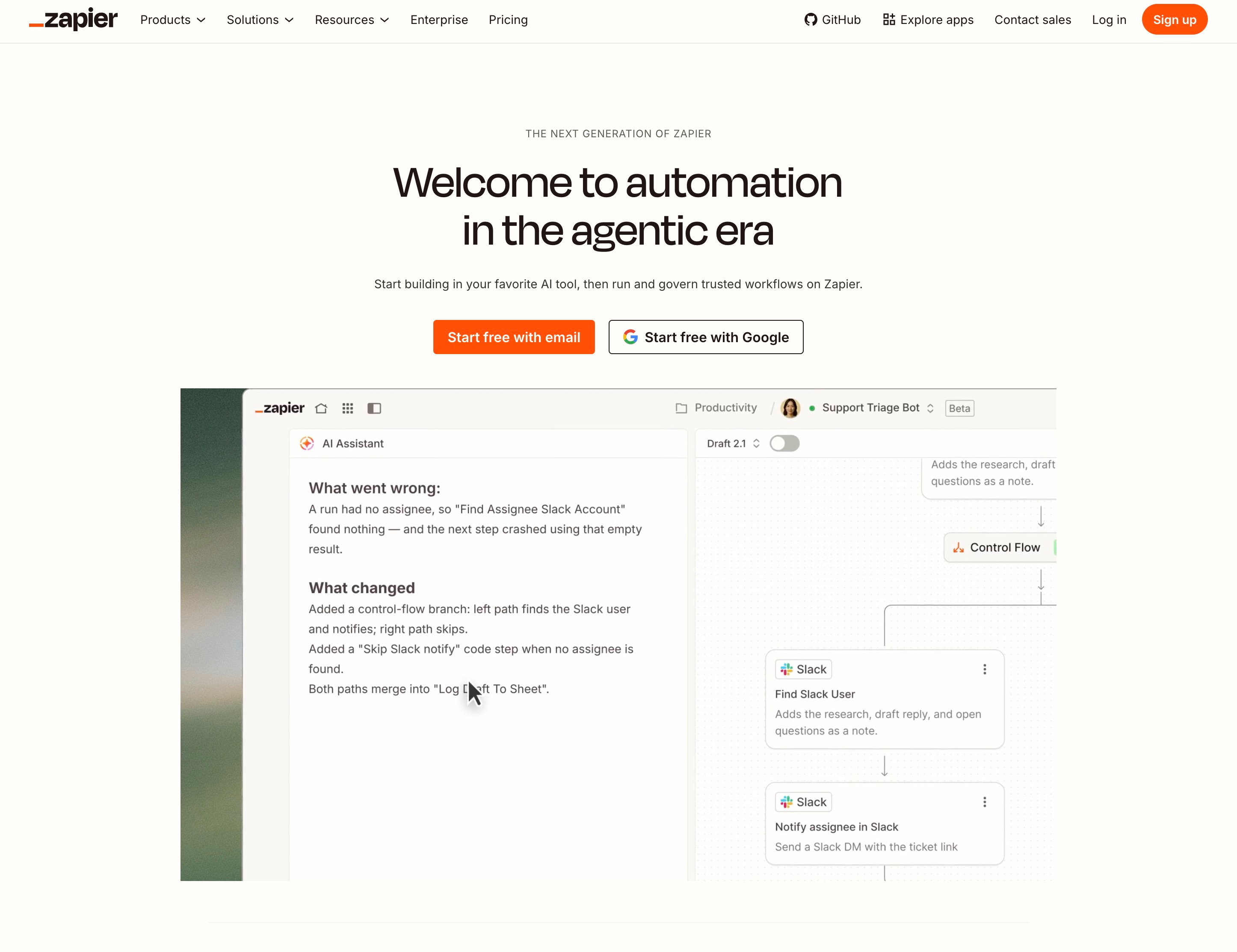
My biggest problem with this ad is where you land when you click on it.
The ad was about automating boring tasks, effectively. But then it drops you on their homepage, which is all about “automation in the agentic era” and “start building in your favourite AI tool”.
From that ad, I should be landing on a page focused on simpler automations. Ideally, if the targeting is precise enough, it would even drop me on one of their use case pages. if I’m in marketing drop me here, if I’m a project manager, drop me here, etc.
Or if that’s not possible, maybe just drop me on the apps page so they can quickly see all the different places Zapier can help.
Their core positioning and messaging is clearly focused on agentic AI (surprise surprise), but it’s just a mismatch between the messaging in the ad and the homepage copy. And it creates unnecessary friction.
The Verdict
The ad itself is good. The hook is strong, the story is a little generic (potentially on purpose to not need as tight targeting), and the CTA is good.
It’s the landing page that feels disconnected. It feels clear that the homepage is written by a completely different team to whoever wrote the ad.