

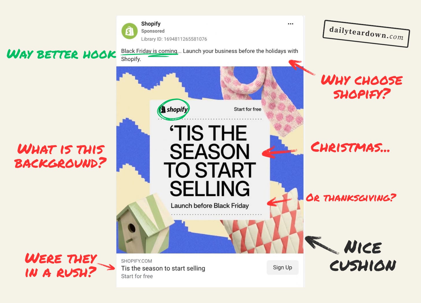
The Hook
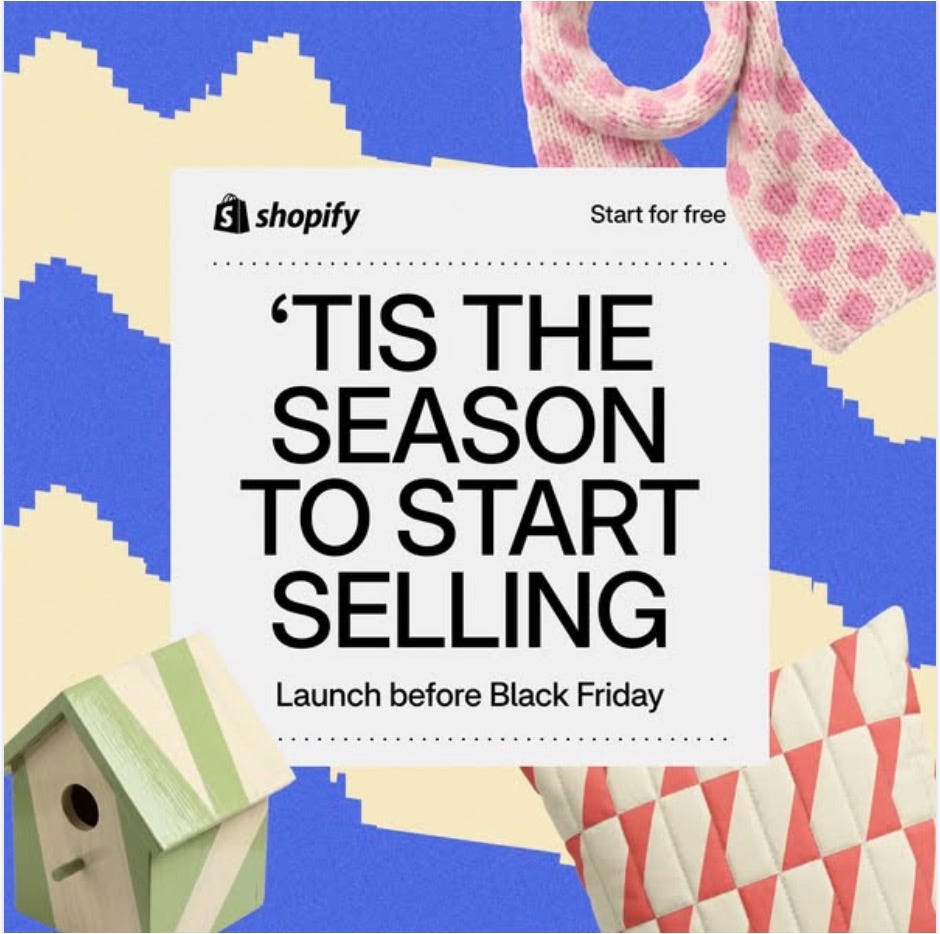
I’m so confused by this hook. “‘Tis the season to start selling” is fine, I guess. Cliched, but fine.
But then “Launch before Black Friday” throws me off. Maybe it’s because I’m British, but the heading is clearly a Christmas thing, but Black Friday is a Thanksgiving thing, right?
So we’ve got a Christmas-themed hook, followed by ‘Launch before Black Friday’ to create some urgency.
And the design is…just a bit weird. Not sure what the blue and white fuzzy background is. Then just three random products. I would guess the three products are supposed to be gifts? But the background doesn’t exactly scream festive or Christmas.
The Shopify logo fits fine. The ‘Start for free’ feels like it could be much more dominant than almost hiding behind the scarf.
It just feels…lazy. Why not go for a headline that actually plays into the urgency. “Black Friday is coming” or “Gift season starts soon” maybe? The latter probably works best because you can keep the subheading in the image.
I don’t know how to explain this, but it feels like a marketers headline, not a copywriters headline.
The Angle
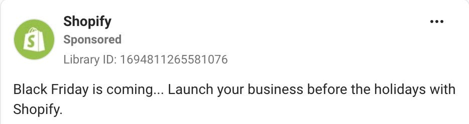
Oh, it already has “Black Friday is coming” in the primary text. Better late than never, I guess.
Actually, this primary text would work far better as the main image hook:
Head: BLACK FRIDAY IS COMING
Sub: Launch your business before the holidays
The angle itself is pretty clear, but it makes no effort to take you through to the action. The image has a weak hook, then this just retreads the same ground (albeit in a better way).
It has the room to tell more of a story. Talk about how the busiest season for online sellers is coming up, so get set up now ready for gift season.
You could even use some stats about how much more vendors sell during this period, to really double down on the angle. This is clearly targeted at people who already want to open a shop, but either on the fence whether to or not, or on the fence over what platform to use.
This ad doesn’t actually sell Shopify at all. It purely uses the time constraints, which is fine for the hook. But you’ve got the rest of the ad to say why Shopify. So why not use it?
The Ask


What are we even doing? Just repeating the image headline as the ad headline?
I think this is the problem with reviewing the ads of big companies. I don’t want to ever punch down and review the ads of small startups. But the big boys don’t seem to give a fuck. They just whack any old shit up there, knowing they’ll still dominate the market.
It would be so easy to go with something like “Get your store set up before Black Friday” to bring the narrative home.
Then “Start for free” as the description is fine. But again it’s a copy + paste from the image.
The Landing
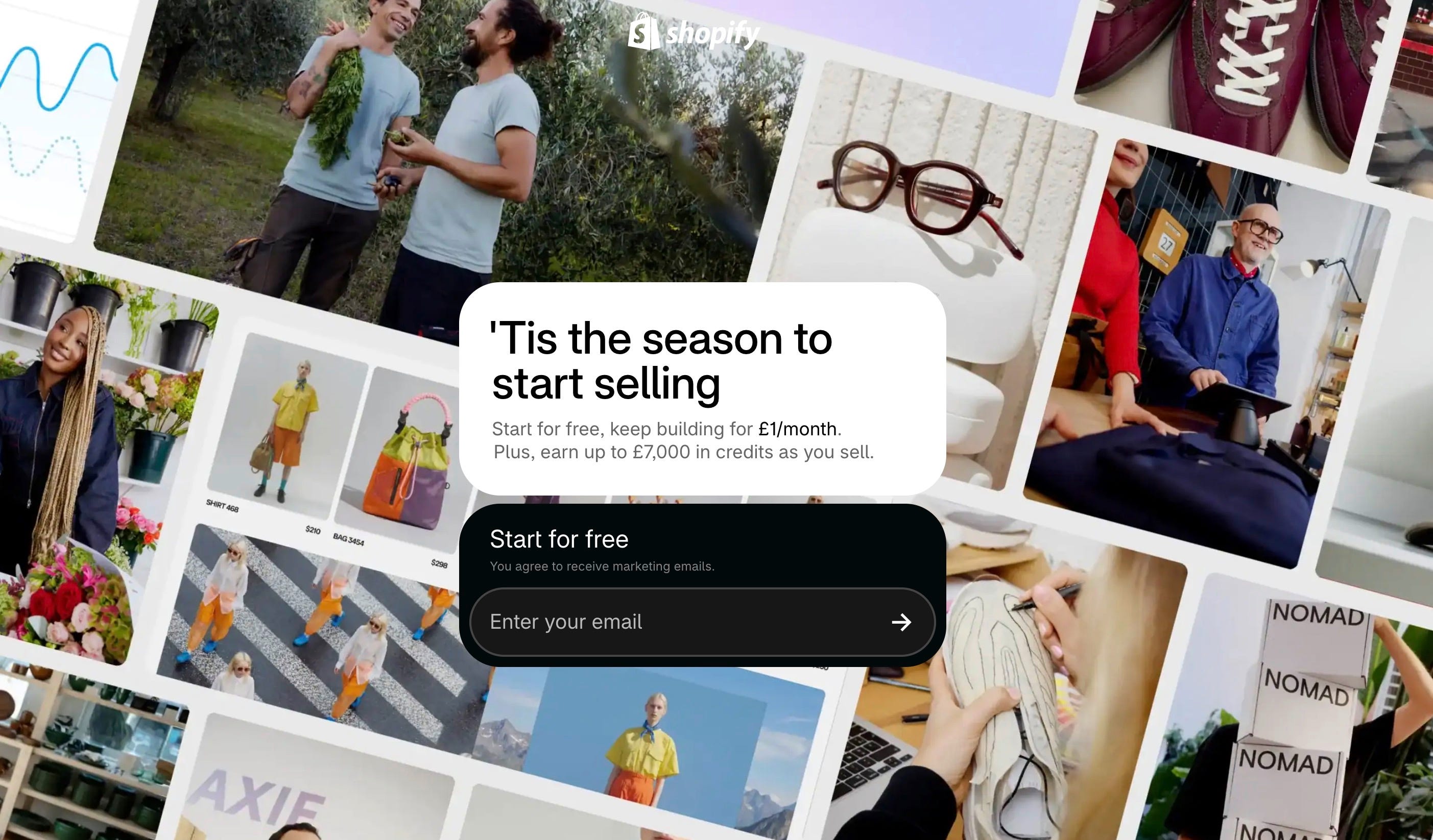
Oh, I see. They just copied the H1 from the landing page and pasted it into the image and the ad headline.
Because who’s got time to think of something original?
(I’m starting to worry that these teardowns are too negative. I promise I’ll try to find some better ads soon.)
But yeah, this is a decent enough landing page from that ad. It’s consistent in messaging (at least with the headings), and low friction. It’s also a landing page that highlights some key features, without being too hefty.
They could do more to play into the narrative, and explain why it matters that the festive season is coming up. But it’s fine.
The Verdict
I think the angle is a good one for a campaign. Create some urgency, and hopefully get those people on the fence about starting a Shopify site to just commit. There’s just so much more they could do with this angle.
It’s infuriating how little thought or imagination went into this funnel.