

I’m doing something a bit different today. Instead of tearing down an ad funnel, I’m looking at a case study. Partly for a bit of variety, but mostly because I saw this case study and wanted a wee rant.
The Hook

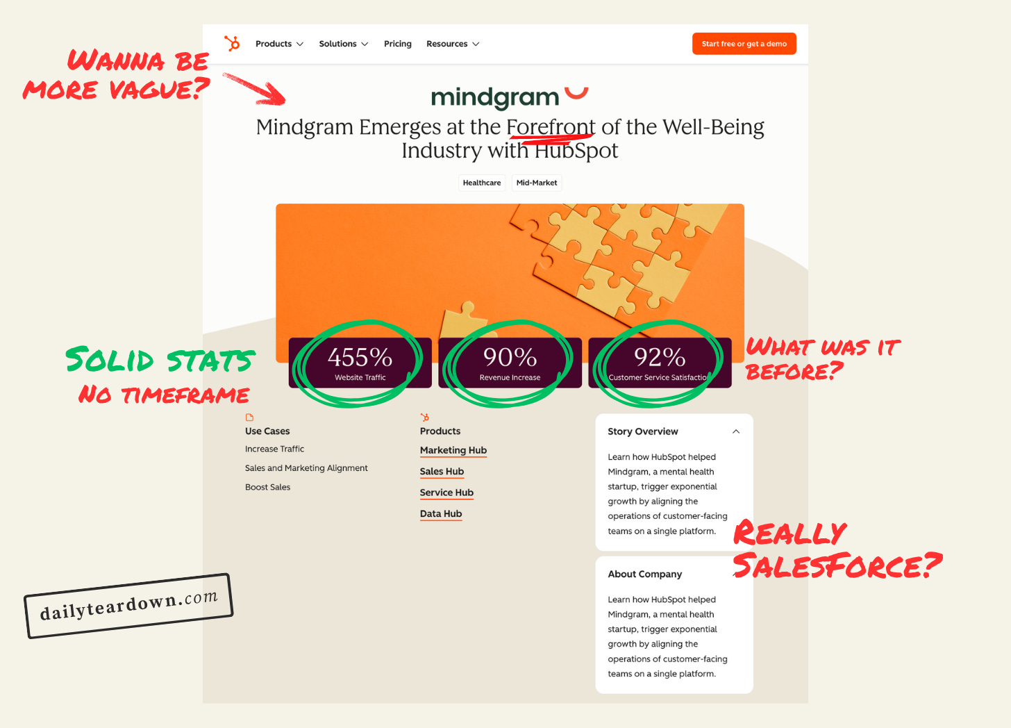
This is what caught my eye…in a bad way. If you didn’t know, I own bestcasestud.io, so I know a thing or two about good case studies. And rule one is to have a headline that actually says something.
“at the forefront” is the definition of a nothingy headline. What does ‘forefront’ mean in this context? It’s a meaningless marketing headline that does nothing but massage an ego.
Also, ‘with HubSpot’ irritates me here. How does something emerge with HubSpot? It’s just passive, lazy nothingness.
“As of October 2026, HubSpot (NYSE: HUBS) has a market capitalization of approximately $11.34 billion.”
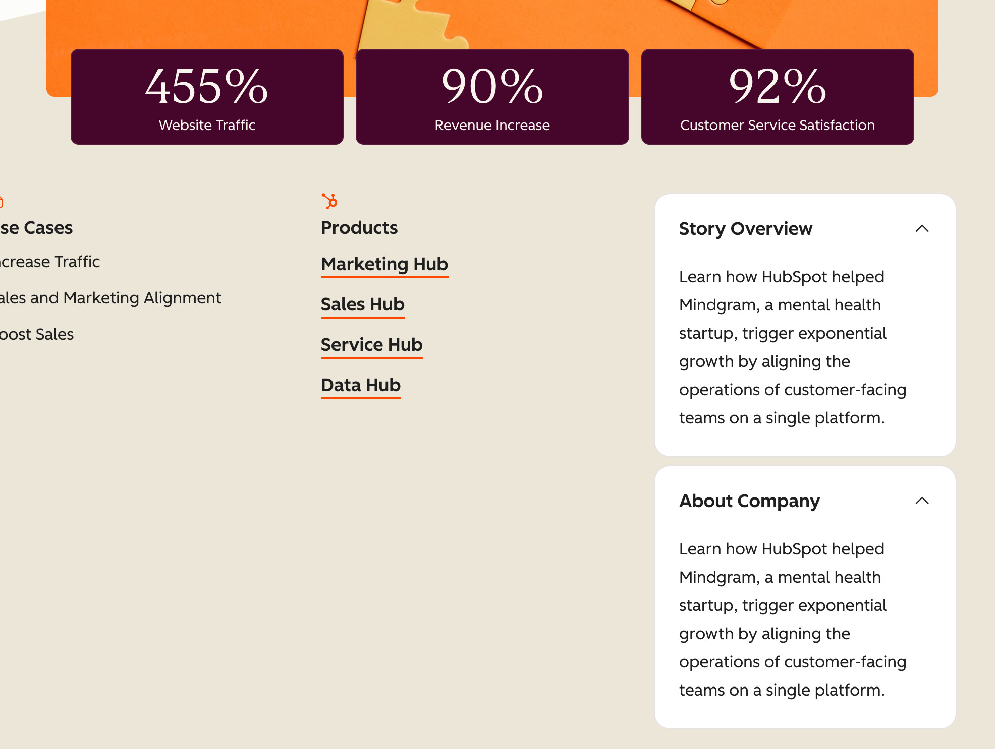
I just wanted to remind you how much HubSpot was worth, while pointing out that they just pasted the same generic paragraph into the ‘Story Overview’ and ‘About Company’ sections.
These sections are supposed to give you quick context at a glance. You see the kind of company they helped, and a short summary of how they helped them. These sections are also used by search engines and LLMs to understand who they should show this page to.
I have no idea how this gets missed at a company this big, but it was…and it’s not a good look.
Now, something I do like. The numbers for website traffic, revenue increased, and customer satisfaction are all great numbers to shout about. And if the reader only reads this, it’s a very good section.
The Angle
You’d think I’d know what the angle was already from the heading, stats, and story overview, but I don’t. Let’s see if the main body digs into it.
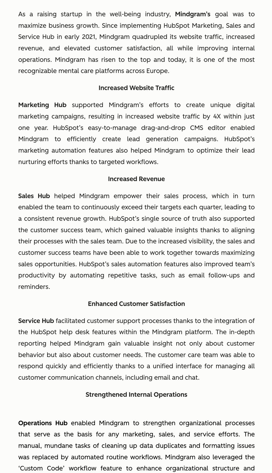
OK, so a few things to unpack here:
The first is that it’s quite disconcerting how uniformly each paragraph is formatted. From reading, I don’t think it’s AI. But it’s very odd for a human writer to write like this.
But narratively it’s quite strong. It starts at the problem, then systematically breaks down the different ways HubSpot helped them. It has the bones of a decent case study.
The problem is that this doesn’t feel like social proof. There are no quotes, videos, names, pictures of real people, etc. It just feels devoid of any real humanity. This isn’t a case study from the perspective of the customer, it’s just “Here are the stats we pulled out of our software".
It’s technically a case study, but not a compelling one. As a reader, I want to know what the customer thought, in their own words. Instead, I just get a corporate summary of how they worked with a client.
It also doesn’t directly address the stats it mentioned. It gives some specific stats at the top, then does nothing to put them into context. What were the timelines? What was the customer percentage before? These things that build credibility.
Just a short case study video at the top would go a long way to making this feel more like a proper case study, rather than a placeholder.
The Ask
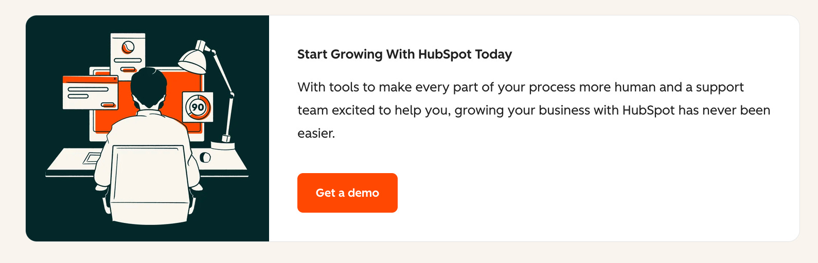
Nothing much to criticise or praise with this CTA. It’s pretty generic, but is consistent enough with the narrative of the case study.
The Landing
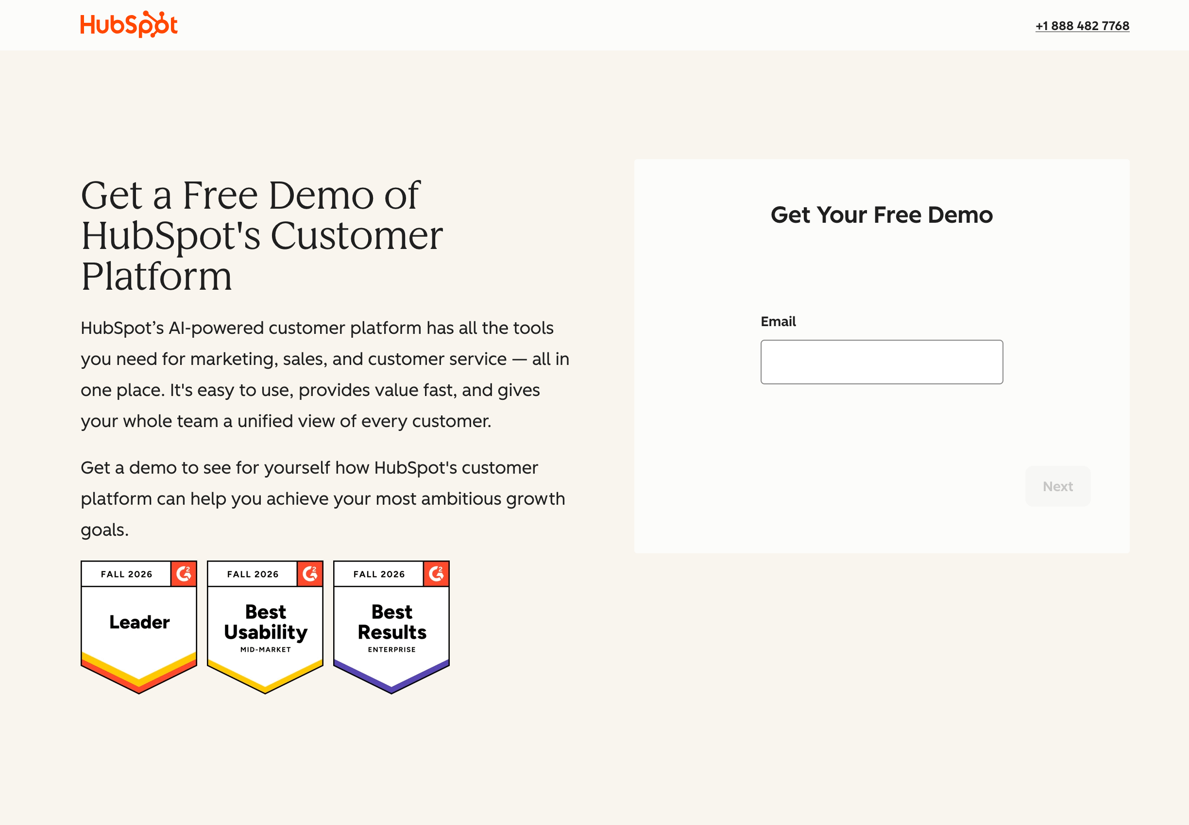
The landing page is also largely fine. But what’s going on with that form on the right? A massive white box with one field? So much blank space to the point I worried I’d fallen for a phishing scam.
The Verdict
Case studies are all about building trust and saying “Hey, this customer is like you, and we helped them.”. But this case study doesn’t do that. It feels like an unfinished case study, and not just because some bits are literally unfinished.
A video, some quotes, and a meaningful headline would transform this case study. But, for now, it’s just a missed opportunity.