

The Hook

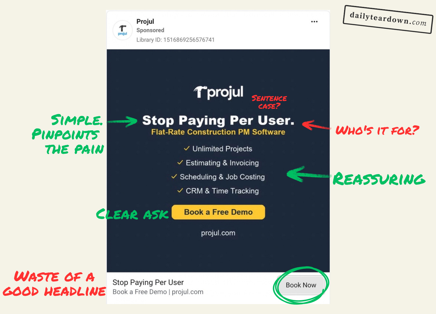
I really like a simple hook. And “Stop Paying Per User” is definitely a simple hook.
What I like about it is that it’s pinpoint on the pain point it’s targeting. For scaling companies, per-user pricing can become extremely expensive, so providing the targeting is on-point, this hook should land.
The biggest criticism I have is that the hook could be more specific with who they’re targeting. I know this is immediately covered in the subhead, but “Stop paying per user for construction PM software” might do a better job of grabbing the right eyes.
It’s a bit more to read, but 8 words isn’t too long. And at a glance it delivers the whole hook.
The problem could also be solved with making the sub-head more prominent. But overall it’s a decent hook, with room for improvement.
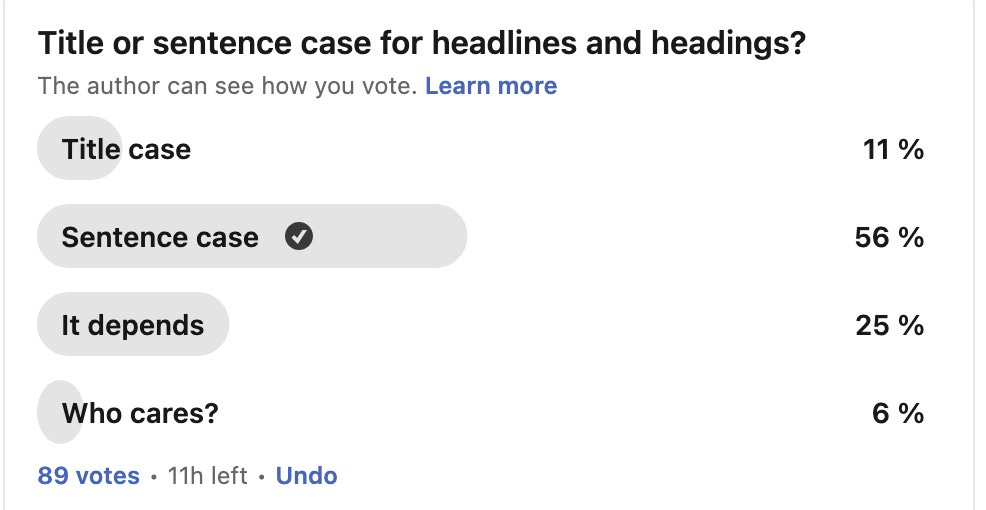
Sidenote: I’m really not a fan of using title case in ad headings. I actually posted about this on LinkedIn, and it seems that people share this distaste. It’s worth reading the comments to see what people said, but I think the main themes were readability/scannability and a sense that it feels less human. So I think sentence or even all caps would work better here.
The Angle
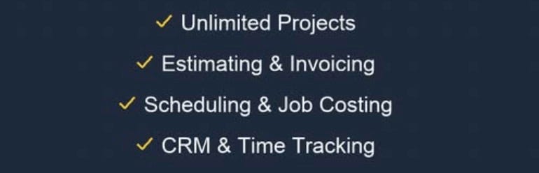
This ad has no primary text, so the whole angle is contained in the image copy. And it does a great job.
The biggest concern of moving away from per-user pricing is losing key features and functionality. Or being forced onto per-project pricing. This image copy addresses these in a very simple way.
The ad is clearly targeted at someone who already wants to switch away from per-user pricing, and the ask is to book a demo, which is a lower commitment ask that a free trial or the like. So this ad does a very simple thing not enough ads do: it says it’s piece then moves out of the way.
I actually like that there’s no primary text here. Primary text can be really useful, but in this ad it would have been superfluous, and likely damaging. The choice to keep it contained in the image is a smart one. And the angle itself is strong.
The Ask

The ad headline is BY FAR the weakest part of this ad. It just repeats the image headline “Stop Paying Per User”, same title case, exact same wording. It’s a waste.
This ad is already extremely economical with words and message, but this ads friction at the worst possible point. The hook has grabbed you, the checklist has reassured you, and…repetition?
The reader just wants to know what to do next. So this should just say “Book your free demo”.
Then the description can just stab a bit more at that pain point. Something like “Scaling shouldn’t cost you money” that just reiterates why they want to switch.
The Landing
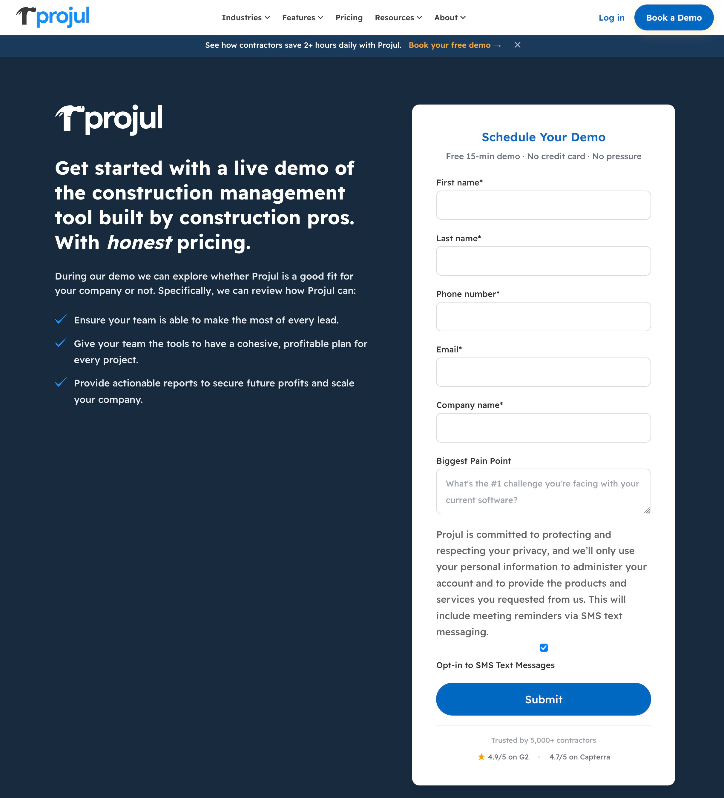
Apart from the cartoonishly tall form panel, this landing page is fine. It’s the standard demo booking page, with pretty generic copy.
This is alright, as you’re hoping they’re just filling in the form at this point.
There’s an argument to be made that it wouldn’t take much to put together a custom demo page focused around per-user pricing. Something that just addresses the objections and pain point in a few more words. But I’m not sure this would make a huge difference.
The Verdict
I like this ad! And I really like containing the bulk of the copy to the image. I think especially on Meta, this is a smart move and I’m surprised more don’t do it.
With the tweak to the image header, and a better headline, this becomes a very strong ad that takes you through hook > angle > ask at an impressive speed and pinpoint pain point targeting.