

The Hook
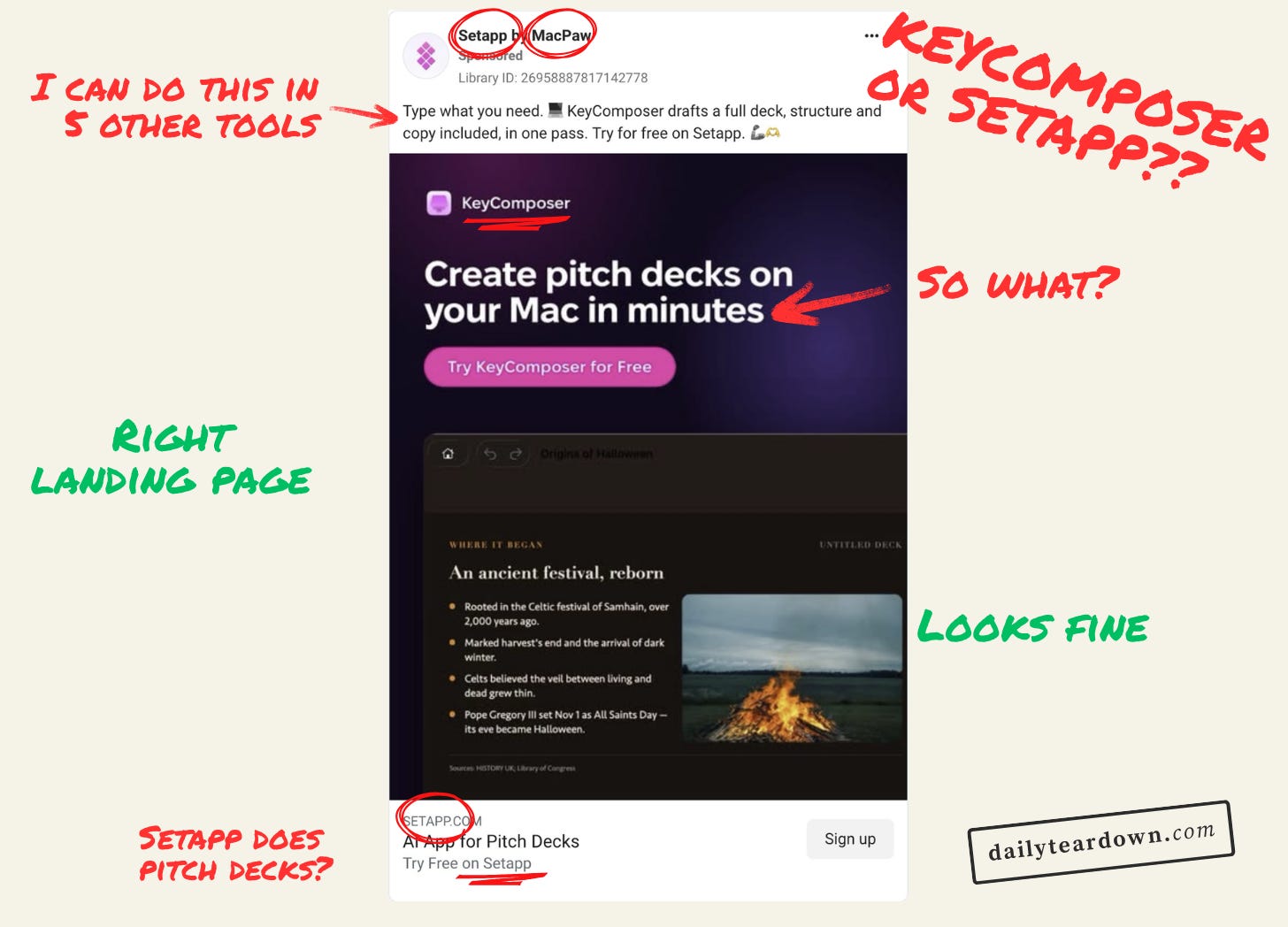
If I was reviewing this hook five years ago, I would have said it was good. Maybe the biggest improvement would have been more specific quantification. “Create pitch decks on your Mac in under five minutes” maybe.
But in 2026, this hook is…meh.
Create a pitch deck in minutes? Sure. Let me just open ChatGPT, Canva, Claude, Figma, etc. Easy.
This just isn’t a hook any more. If your whole USP is the speed, you’re not going to do very well. The hook needs to address a problem that actually resonates with your reader.
Having a quick look at their page on Setapp (who are promoting the app), they seem to be a competitor to Canva’s AI slide generator feature. So they should be finding something that pisses people off about that feature.
As a Canva user, I find that it’s very much a jack of all trades, master of none. It’s easy to create something, but the something is rarely as good as I want it to be. Maybe a skill issue, but I’m sure others will share this.
You tend to find yourself bogged down with templates, and then spending time adapting the templates. So this could be a good way to hook them in.
The other side to that coin is a chatbot like ChatGPT or Claude. But the problem with those is that you can only edit with prompts, which gets annoying. Especially when you just want to drag something a few pixels.
So the hook there would be finding a way to say something like “Generate an editable deck in seconds”. Obviously that’s a bit clumsy and if this was for a client I’d mull this over for a few hours. But you get the point.
The Angle

Again, the intro text just doesn’t tell me how it’s different from ChatGPT, Claude, Gemini, etc. The focus is on generating the first deck, when that’s nothing new.
Most people who would find this appealing already have access to tools which can do this. There’s no differentiator here.
And the last sentence “Try for free on Setapp” also brings up a new problem I’ll get onto in the next section.
The Ask

I know what Setapp is. I even have a subscription. But if I didn’t, I wouldn’t know what the fuck was going on.
The image only mentions KeyComposer, the ad itself is attributed to ‘Setapp by MacPaw’, the intro text mentions KeyComposer then Setapp, then this CTA is just about Setapp.
The ad makes the assumption that you know Setapp is a multi-app subscription service. But most people won’t. Which means that even if someone knows they want a tool like this, they’re given pause to click the CTA because they don’t know what they’re signing up for.
This ad needs to do two things:
Tell you why you should want KeyComposer
Make it clear that it’s only available via the multi-app subscription
You can do this explicitly in the intro. But you can also include “Only available on Setapp” on the image to set the context early. Making it clear that KeyComposer is the subject of the ad, and Setapp is the way you get it.
This CTA is just nuts. It has the Setapp domain, then a summary of KeyComposer, then repeats “Try Free on Setapp” from the intro.
I talk a lot about removing friction from these funnels, and this whole confusion is just a lot of unnecessary friction.
The Landing
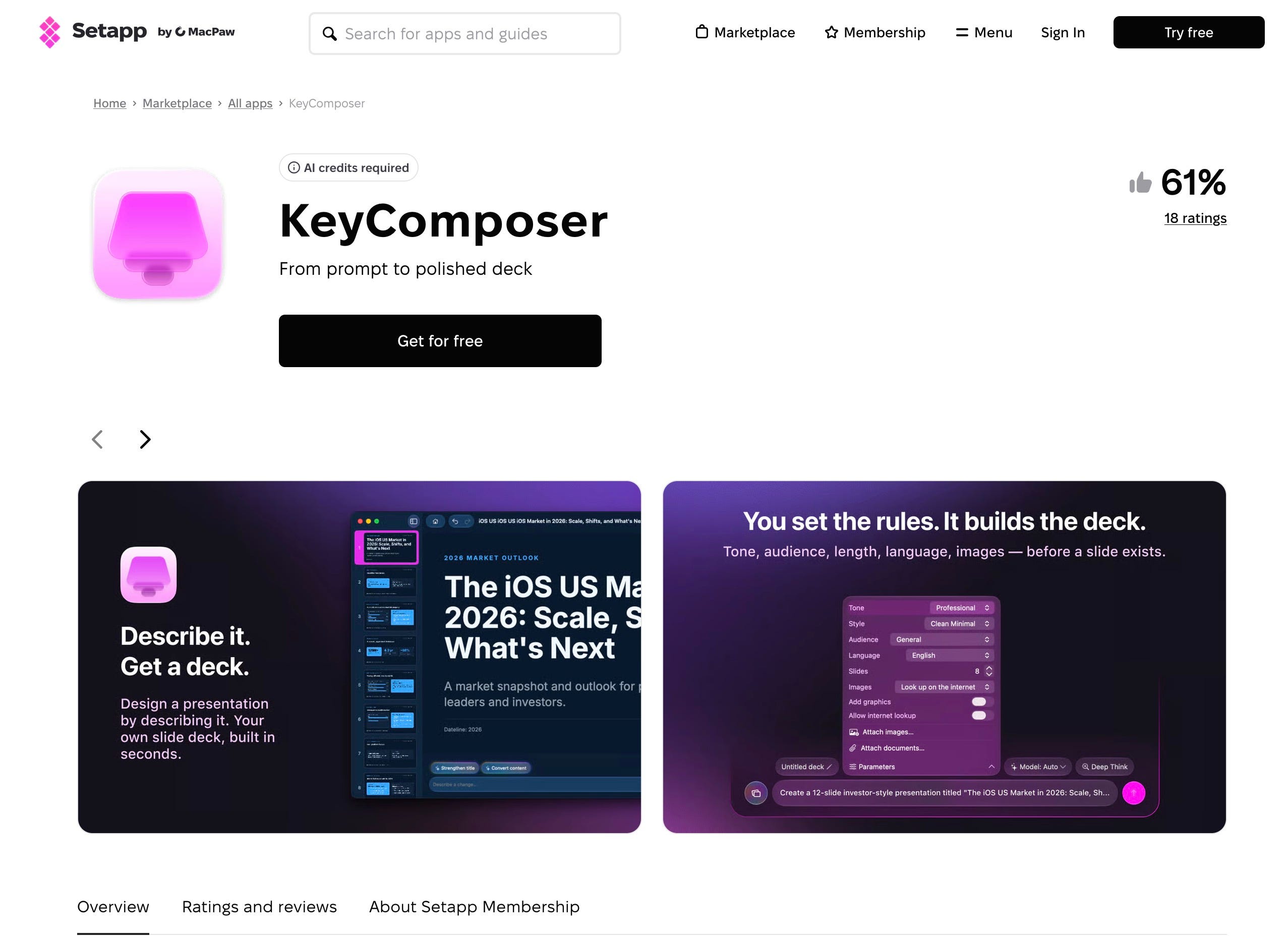
With that said, the landing page is the right destination. It’s a landing page for KeyComposer, with screenshots, an overview, etc.
It also includes the quite unfavourable 61% rating, which won’t help anything.
But by and large, this is the place to be. It’s clearly a page about KeyComposer, but it’s hosted on the Setapp site. And clicking “Get for free” takes you to another page that focuses on KeyComposer:
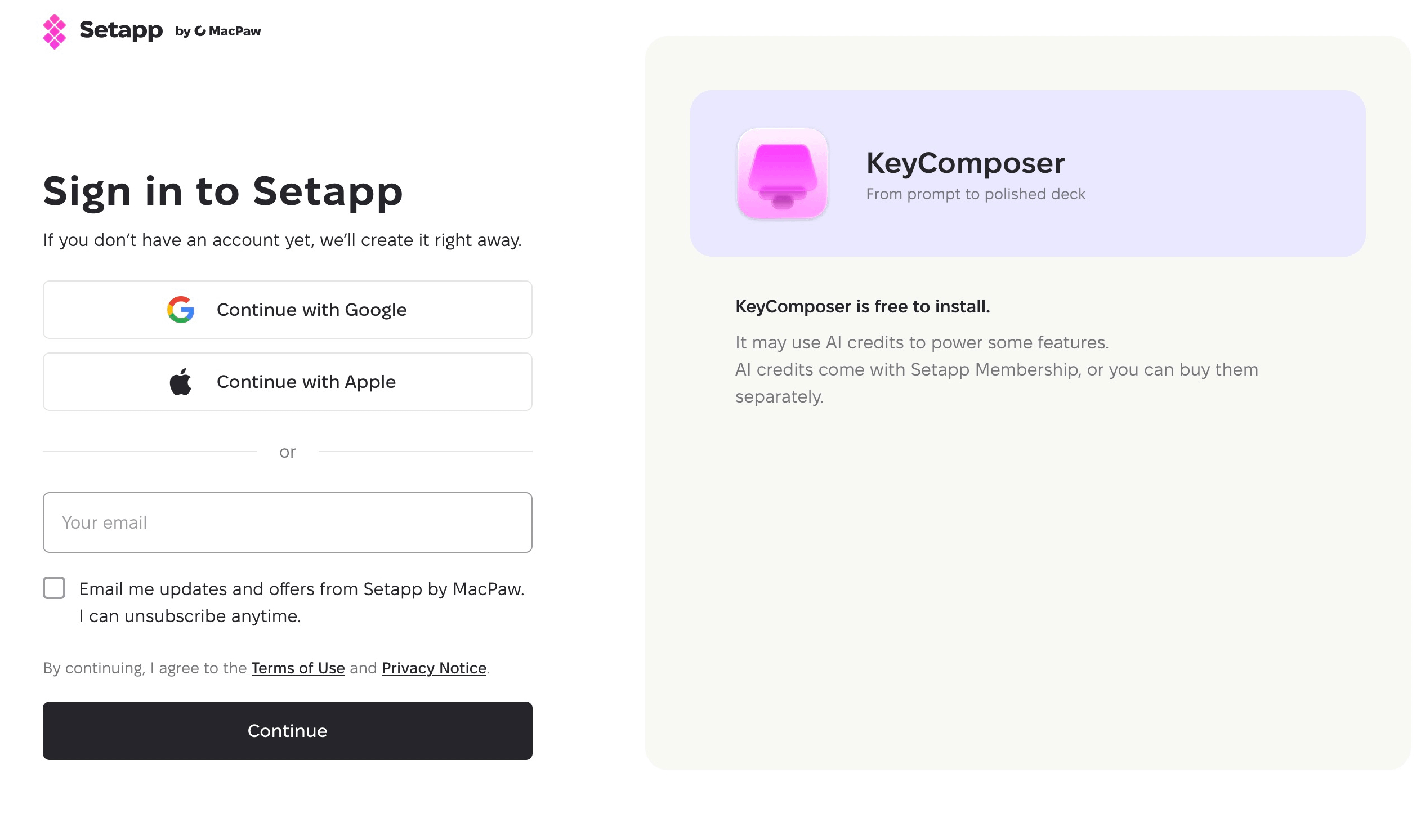
This does what it needs to do.
The Verdict
This funnel has two key problems. The first is that they need to find a proper differentiator to shout about. Generating slides in minutes isn’t a boast anymore.
The second is the muddies water as to whether this is an ad for KeyComposer or Setapp.
It’s not an awful ad, but it also doesn’t have much going for it.