

The Hook
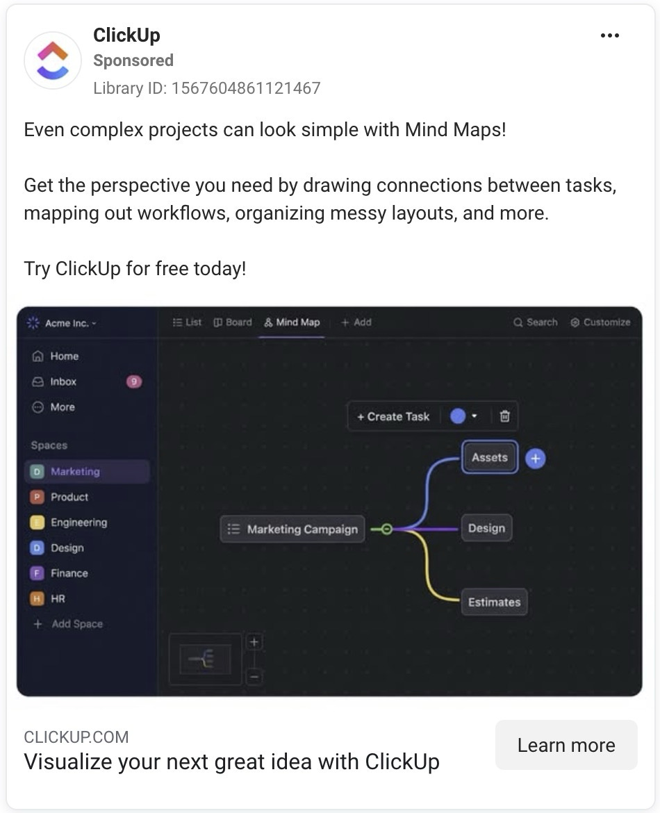
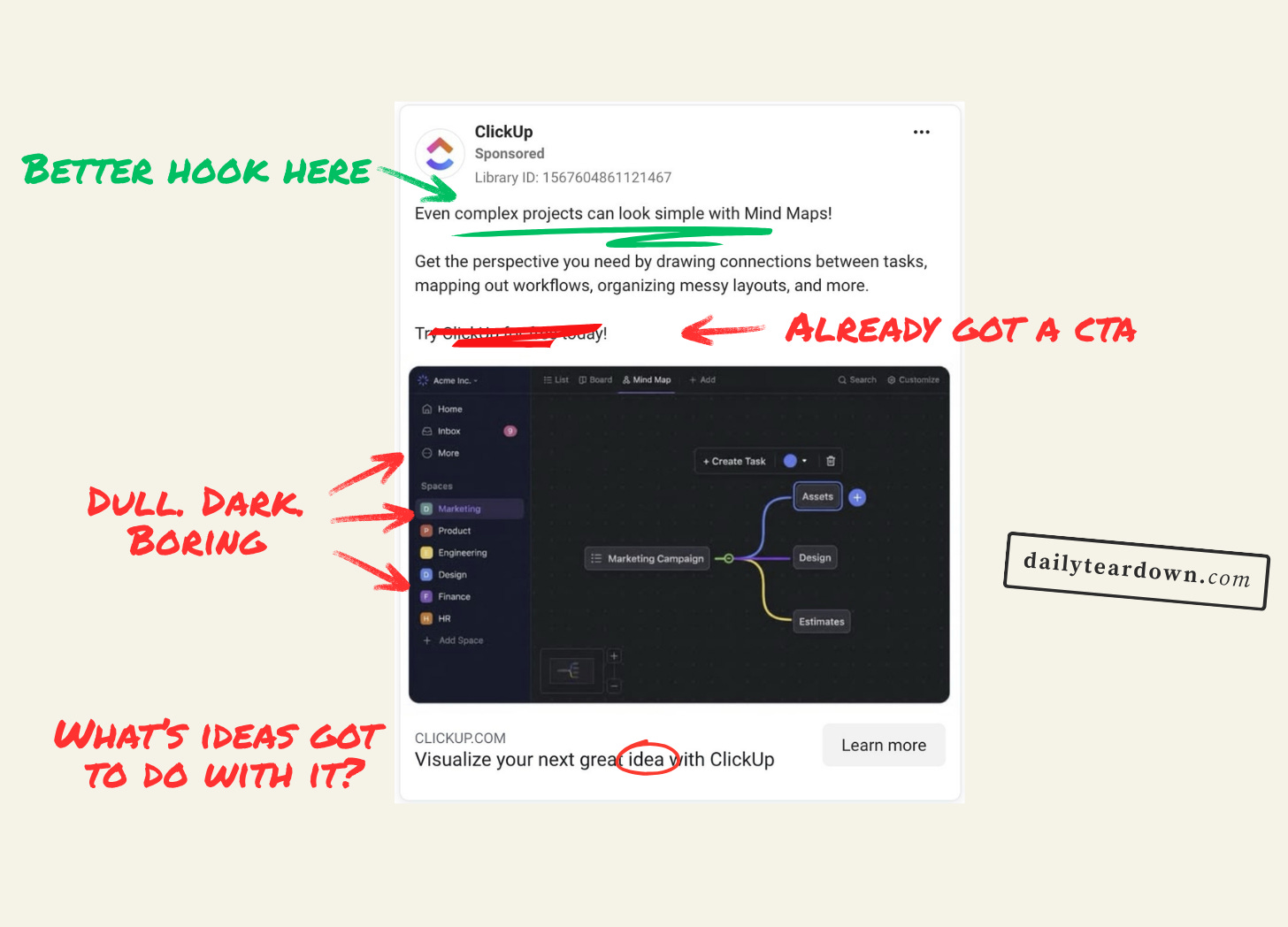
For some reason, ClickUp thinks a rather dull looking mind map screenshot will work as a hook for this ad. Which assumes there are people out there who thinks mindmaps are particularly eye-catching.
But the problem with a mind maps is that they are useful, but visually a mess. Once they become useful, they’re as hard to read as the London Underground map.
ClickUp know this, which is why they’ve shown and extremely basic three-pronged mind map. Which isn’t useful to anyone.
Potentially this as is for a very specific person: A ClickUp user who has been clamouring for mind maps in ClickUp for a very long time. In which case this only proves to let them know. But for anyone else, there’s no hook.
If we ignore the image and focus on the first line of the primary text, we get this:
"Even complex projects can look simple with Mind Maps!”
This is a better hook. Which is a shame, as no-one is likely to read this line. Making complex projects look simple is a decent benefit. They could have leant into this more with an image header. Something like “Complex projects, simplified” to better introduce the new feature.
The Angle
The angle of the ad is quite clear. It’s a BOFU ad that assumes you know what ClickUp is, and it letting you know two things:
They’ve added mind maps
They’re routinely adding new features
Based on the copy, they also assume the reader is aware of mind maps, but want to make it clear how they would work in a project management setting. Which isn’t a bad idea. “Get the perspective you need” feels quite flat, but “drawing connections between tasks, mapping out workflows, organizing messy layouts” are all things that sound useful.
It’s a simple angle, but I think it would work if it wasn’t let down by the absence of a hook. And I’m saying that as someone who uses ClickUp, and who’s used MindMaps before. So I’m probably their target demo here.
The Ask
There’s a reason this section is called ‘The Ask’ and not ‘The Asks’. A PPC ad needs to essentially have a simple flow:
Hook
Story
Offer
And you only need one of each. Two hooks fight with each other. Two stories will fight with each other.
And in this case, two offers/asks fight with each other.
What do ClickUp want the reader to do next?
“Try ClickUp for free today!” tells me they want me to sign up for a free account. But then we have “Learn more” which takes us to a page about mind maps. They should have ditched the line in the primary text, and kept the button.
I’m also not sure about “Visualize your next great idea with ClickUp”. As I said, the ‘Learn more’ button takes you to a page about mind maps. So this headline should match. Maybe “Visualize your next great idea with mind maps”. But even then, why are we talking about ideas when the rest of the ad has been about projects?
“Visualize your project with mind maps” is probably the easiest fix here. It sets up the landing page, while keeping with the key narrative.
The Landing
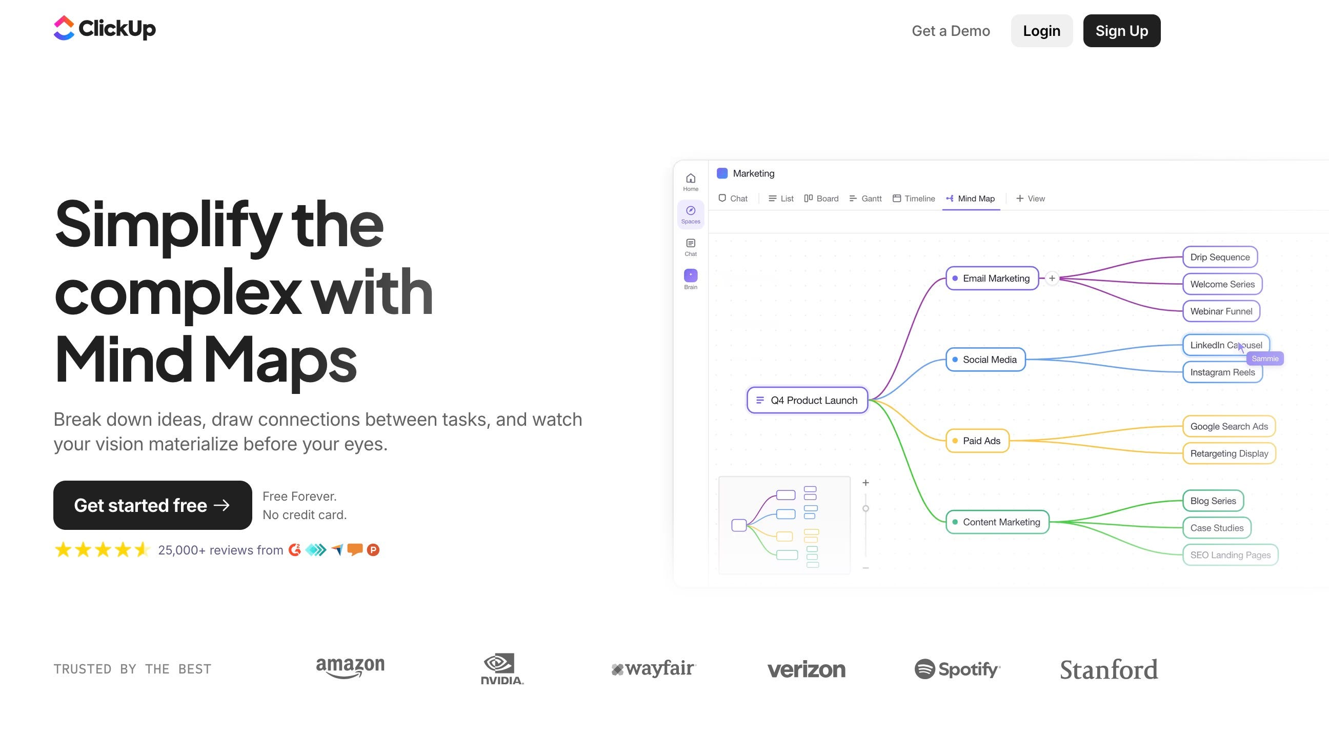
When you click ‘Learn more’, you get taken to this page. And to be clear, the above isn’t part of that page. It’s the entire page.
It doesn’t go into more detail about how mind maps work, it doesn’t give you more use cases, and it doesn’t really say anything beyond what the ad said.
The one thing it does do is show a more fleshed out mind map. Which is actually a far more appealing image. It’s helped by being light rather than dark and dreary, but more importantly it paints a clearer picture of how a mind map can actually help. Going that one level deeper to show how tasks fit into groups is just a more engaging demonstration.
But beyond that, this landing page doesn’t really do anything the ad doesn’t already do. Which, if anything, is just adding more friction. They might as well have just taken them to the signup page, rather than waste this click.
The better landing would have been to make this a proper feature landing page. Act like they’re mind map salespeople. Explain why they’re useful, what people use them for, how you can expand or minimise sections, etc.
The only person who gets to this page and clicks ‘Get started free’ is a person who has been putting off getting ClickUp solely because they lack mind maps. But I’ve just looked it up and this isn’t even a new feature. They’ve had mind maps since 2020.
Which means the only person who gets to this page and clicks ‘Get started free’ is a person who has been putting off getting ClickUp solely because they didn’t realise it already had them.
Which feels like an oddly specific person to aim for.
The Verdict
I’m annoyed I chose this as the first case to publish online. It feels almost arrogant to not bother with a hook, and then abandon the pitch once they’ve clicked the ad.
There’s a good funnel in here somewhere. One that grabs attention, clearly communicates the benefits of mind maps, and creates a compelling case for starting a free trial.
But the funnel we got is just full of gaps.